Loom
A tactile, private-first notes app built around a chronological card pile instead of folders, docs, or dashboards.
Problem
Notes apps default to folders, tags, dashboards, sync, and stock Material chrome — all of which add cognitive overhead before you even type a sentence. The activation energy to capture a thought has crept up to the point that people use the wrong tool, or no tool, instead.
Insight
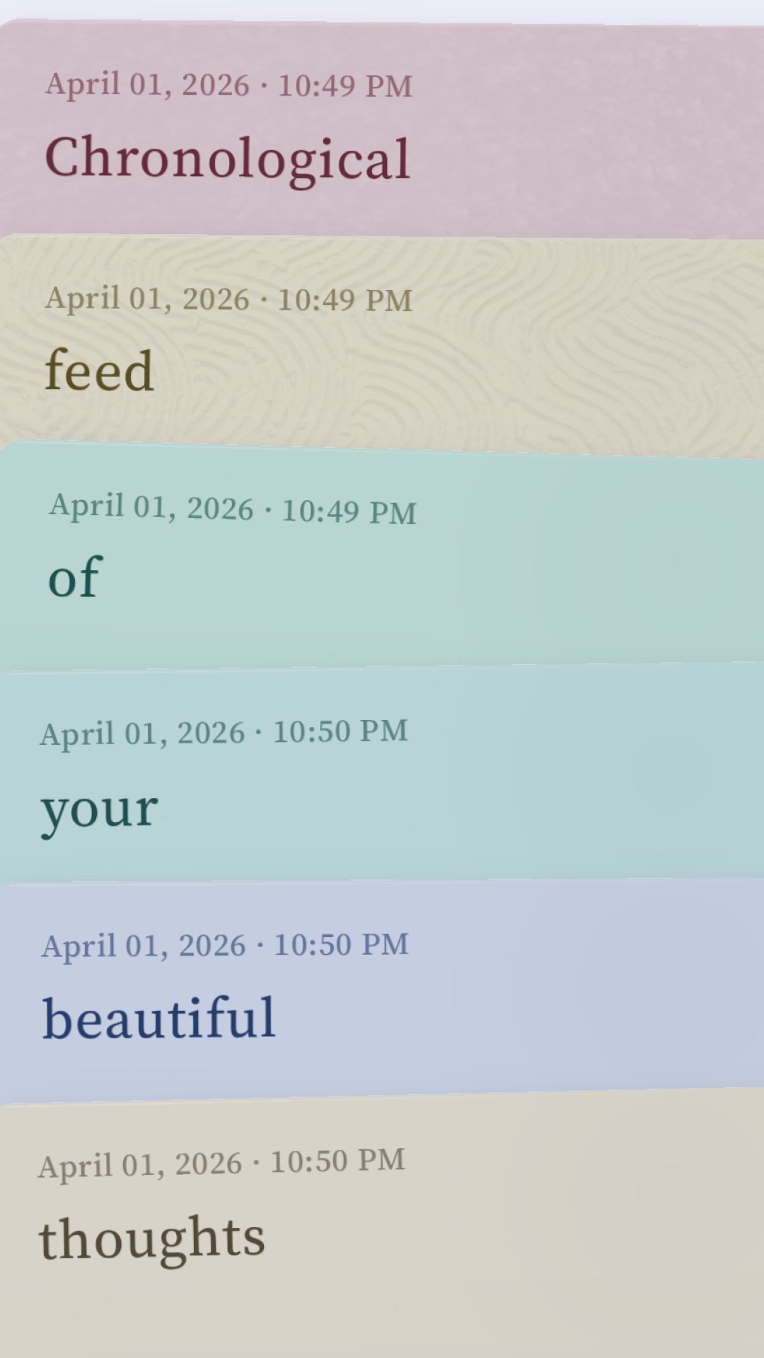
Handling a stack of printed note cards is calming. It’s also the model people actually use when they’re thinking — chronological pile, oldest at the bottom, newest just on top. If we kept that as the literal interface and let structure emerge from language (hashtags) rather than from manual filing, the app would stay out of the way.
Solution
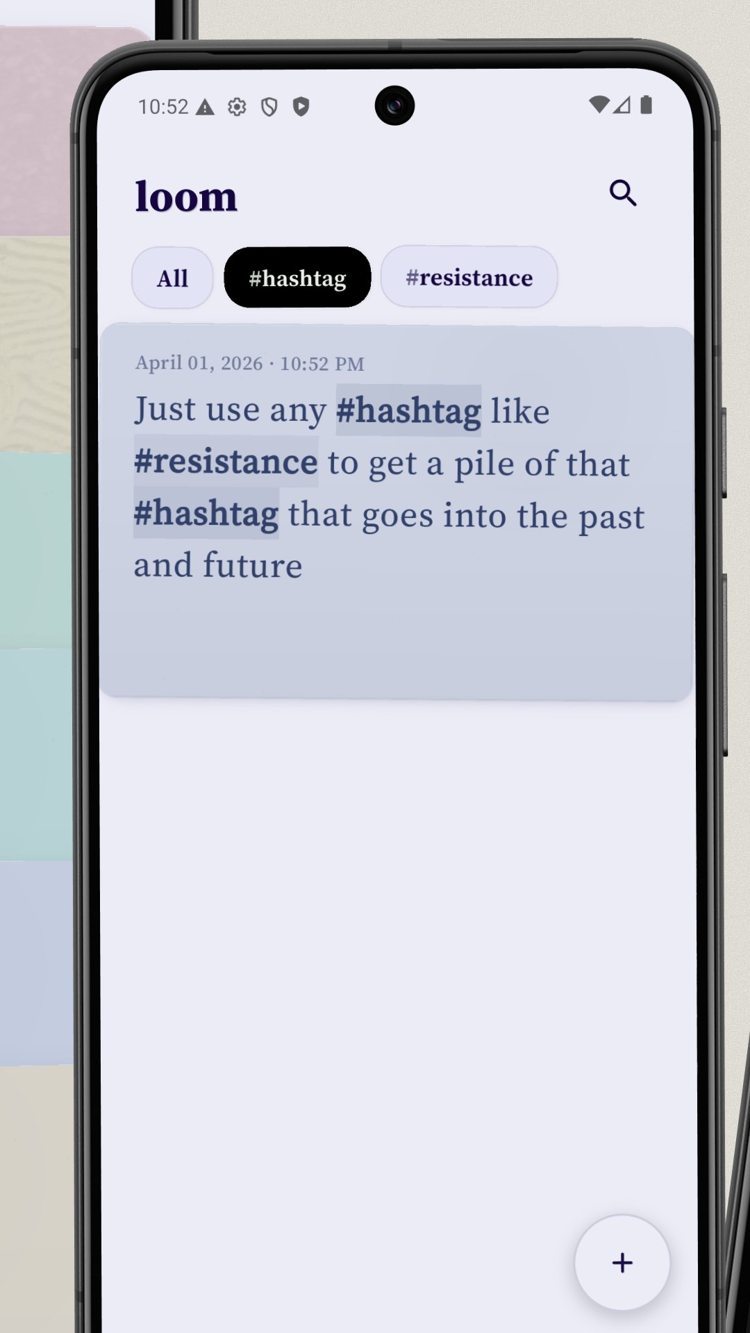
A vertical deck of notes that compresses, lands, stacks, and rebounds with weighted motion and haptics. Paper, ink, letterpress, and risograph-inspired surfaces instead of stock Material. Hashtags can be typed directly, suggested while editing, or created retroactively from search — pulling older matching notes into the same emergent feed.
Live in the app
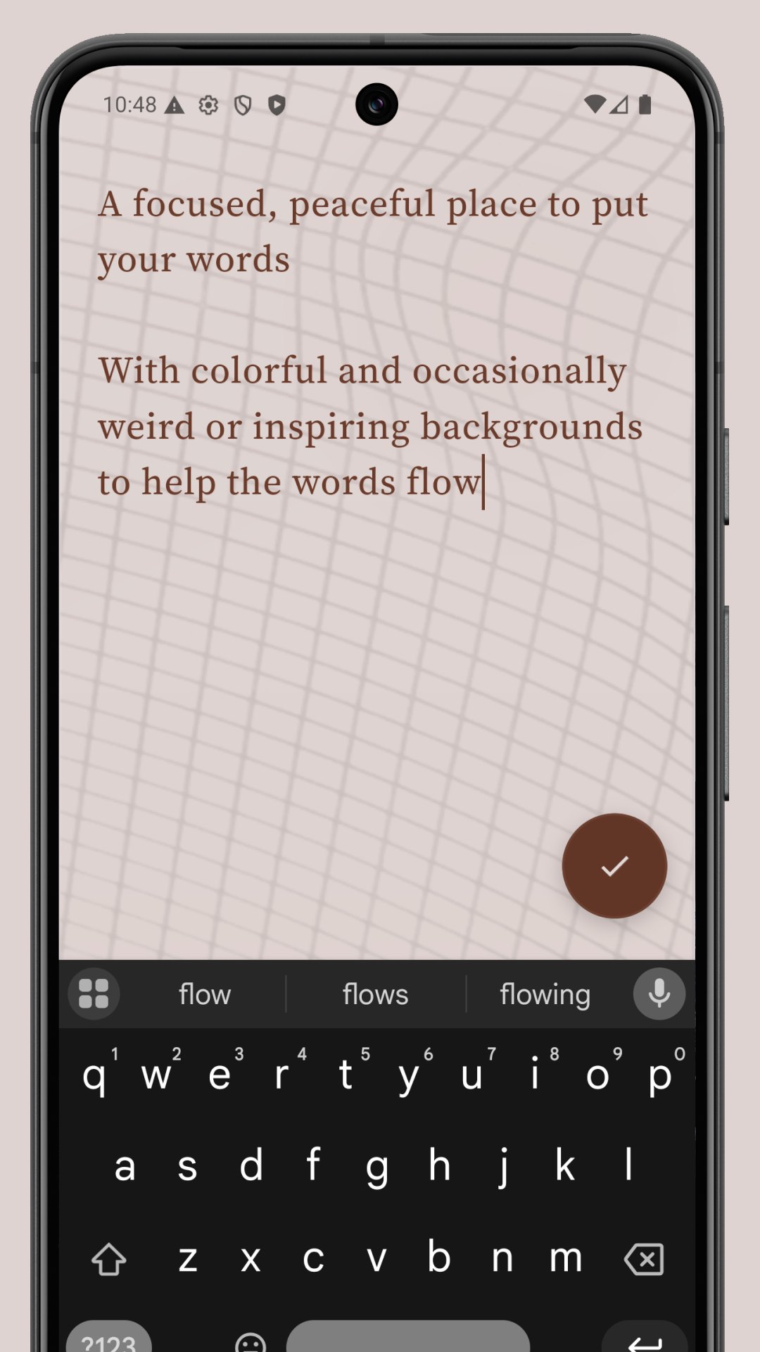
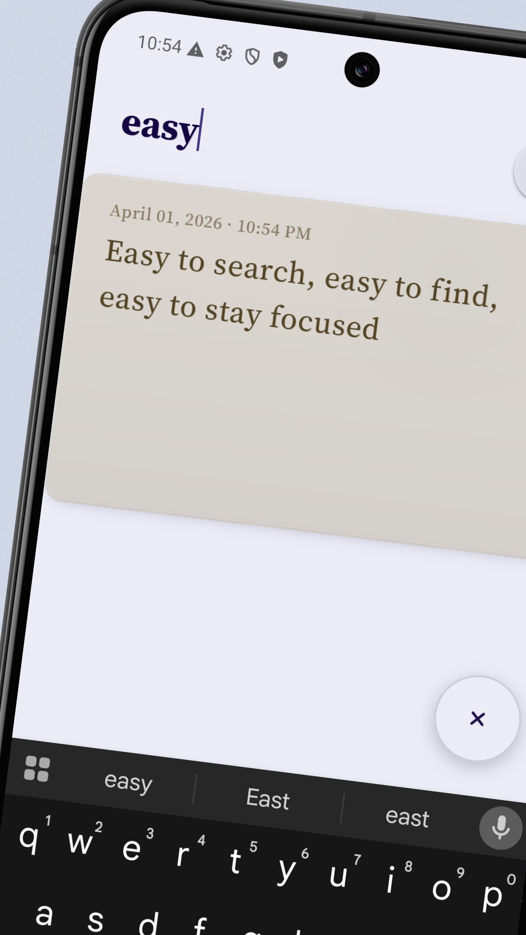
A handful of moments captured from a phone — the pile, the paper textures, the on-purpose tags.
What makes it Loom
Notes live in a vertical deck, not a flat list. The pile can be flung in either direction. Newest sits nearest the bottom.
Cards have weight. Custom scroll physics, weighted settle springs, per-card stack-landing haptics, separate top-stack and bottom-stack impact behavior.
Delete is intentional. Long-press a card, move it into the fire target, and get a burn/countdown affordance with undo. We’re not letting you tap-tap-gone.
Search isn’t just filtering. Search matches both standalone words and mid-string text, but only standalone matches can be turned into a hashtag feed — preserving the integrity of the tag system.
Editing hides the timestamp. Opening an existing note hides its timestamp while editing; unchanged notes close back into the stack with their original timestamp, while saved edits return with an updated edit timestamp.
The save button knows where you are. When you open a note, the action button shows an x — leave anytime, nothing lost. As soon as you start editing, it flips to a check. On a brand-new note it's a check from the start, because there's nothing to discard yet.
The visual system
Printmaking-inspired, not stock-material.
Every surface in Loom is treated like a printed thing — paper substrate, layered ink, the slight deboss around a timestamp where a press would have pushed in. The palette is small: a single ink, a single accent, a single warm paper colour. Nothing in the app looks like a generic app.
Motion is deliberate too. When you fling the pile, cards have weight; when you land back on the stack, the top card settles like it has mass. Edges stay sharp under that motion so the type never smears. The whole thing is designed to feel calm under your thumb — closer to handling a deck of index cards than scrolling a feed.
Local-first, on purpose
Your notes stay on your device.
Loom doesn't sync to a server. Nothing leaves your phone. There's no account to make, no inbox to check, no setting to opt out of. Capture a thought, close the app, come back to it next week — it'll be there, exactly where you put it down.
That choice keeps the app fast (no waiting for network), keeps your stuff yours (no one to leak it), and keeps the product honest about what it's for: thinking, not publishing.
In your pocket now.
Loom is shipping on Google Play today. iOS is up next — I'll drop a badge in here as soon as it's live.